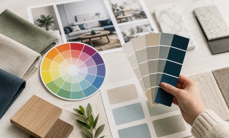
Stand in front of a wall of paint chips and it’s easy to freeze. There are thousands of near-identical shades of white, gray, and greige, and picking the “wrong” one feels like an expensive mistake waiting to happen. The good news is that choosing a color palette isn’t actually guesswork — it’s a skill, built on color theory principles that professional designers rely on every day.
This guide walks through everything you need to know about color theory for interior design — how the color wheel works, how color affects mood, the formulas designers use to build balanced palettes, and how to apply all of it room by room. By the end, you’ll have a repeatable process for choosing colors with confidence, instead of second-guessing every swatch.
If you haven’t already, it’s worth reading our complete guide to interior design first, since color palette decisions work best once you’ve already settled on a general style direction — the two decisions inform each other.
Why Color Theory Matters More Than People Think
Color is one of the fastest, cheapest ways to transform a room — and also one of the easiest ways to get a space to feel subtly “off” without knowing why. Most people choose paint colors in isolation, holding up a single chip and asking, “Do I like this color?” That’s the wrong question. The right question is: “How will this color behave in relationship to everything else in the room — the light, the flooring, the furniture, and the other colors around it?”
Color theory answers that question. It’s not an abstract art-school concept; it’s a practical framework covering how colors relate to one another on the color wheel, how they shift depending on lighting, and how much of each color to actually use. Interior designers rely on it constantly, not because they have a “better eye,” but because they’re working from the same underlying rules — rules that anyone can learn.
There’s also a well-documented psychological dimension to this. Research in environmental psychology has repeatedly shown that color affects mood, heart rate, and even appetite. A palette that looks beautiful in a photo but doesn’t support how you actually want a room to feel is a palette that will eventually frustrate you, no matter how “on trend” it is.
The Color Wheel: The Foundation of Every Palette
Every color palette, whether a professional designer built it or you’re building it yourself, ultimately traces back to the same 12-color wheel most people learned about in grade school. Understanding it properly is the single most useful thing you can do before choosing any paint or fabric.
Primary colors — red, yellow, and blue — can’t be created by mixing other colors. Every other color on the wheel is derived from them.
Secondary colors — orange, green, and purple — are created by mixing two primary colors in equal parts.
Tertiary colors — red-orange, yellow-orange, yellow-green, blue-green, blue-purple, and red-purple — are created by mixing a primary color with a neighboring secondary color.
From this wheel, designers build color schemes using a handful of reliable formulas:
Monochromatic schemes use different shades, tints, and tones of a single color. This is one of the easiest schemes for beginners because it’s nearly impossible to get wrong, and it creates a calm, cohesive look.
Analogous schemes use colors that sit next to each other on the wheel — like blue, blue-green, and green. These feel harmonious and are found frequently in nature, which is part of why they read as so restful.
Complementary schemes pair colors from opposite sides of the wheel — like blue and orange, or red and green. These create high contrast and energy, and work well as an accent strategy rather than an entire room’s palette.
Triadic schemes use three colors evenly spaced around the wheel — like red, yellow, and blue. These are vibrant and balanced but require a confident hand, since triadic palettes can tip into visual chaos if the proportions aren’t controlled carefully.
Neutral schemes rely on whites, grays, beiges, and browns rather than the color wheel’s hues at all. Neutral doesn’t mean colorless — every neutral still carries an undertone, which is covered in more detail below.
Understanding Hue, Value, Tint, Tone, and Shade
Color theory has its own vocabulary, and getting comfortable with it makes every future paint or fabric decision easier.
Hue is simply the pure color itself — red, blue, yellow — before anything is added to lighten, darken, or mute it.
Value refers to how light or dark a color is. Two colors can share the same hue but sit at completely different values, like pale blue versus navy.
Tint is a hue with white added, making it lighter — think blush instead of red, or sky blue instead of true blue.
Shade is a hue with black added, making it darker — burgundy instead of red, or navy instead of true blue.
Tone is a hue with gray added, which mutes and softens it — this is where most sophisticated, “designer-looking” wall colors actually live, since a pure, unmuted hue can feel harsh on a large wall.
Most professional interior palettes lean heavily on tones rather than pure hues, which is part of why a well-designed room often feels calm and cohesive even when it includes several different colors.
The Psychology of Color in Interior Design
Beyond the mechanics of the color wheel, colors carry genuine emotional and physiological associations — well documented enough that they inform everything from hospital design to retail store layouts.
Blues and greens are associated with calm. They’ve been shown to lower heart rate and are a reliable choice for bedrooms, bathrooms, and home offices — anywhere you want to support focus or rest.
Warm reds and oranges stimulate energy and appetite, which is why they show up so frequently in dining rooms and kitchens. They tend to feel overwhelming in bedrooms, where the goal is usually the opposite effect.
Yellows create a sense of optimism and energy, working well in kitchens, entryways, and other transitional spaces, but can feel overstimulating in large doses in a room meant for rest.
Warm whites and creams read as welcoming rather than stark. Pure, cool-toned white can feel clinical in a residential space — this is why most professional designers reach for warm-toned whites for walls and trim.
Deep, moody tones like navy, forest green, or charcoal make large rooms feel intentional and cozy rather than cavernous, and are increasingly popular for rooms meant to feel enveloping, like a primary bedroom or a home office.
None of this means you’re locked into a rigid formula — plenty of beautiful bedrooms use warm, energetic colors, and plenty of great kitchens use cool blues. But understanding the general psychological tendencies gives you a starting point, rather than choosing colors purely by trend.
The 60-30-10 Rule: The Formula Behind Every Balanced Room
If there’s one piece of color theory worth memorizing above everything else, it’s the 60-30-10 rule. It’s the formula most interior designers use, consciously or not, to keep a room’s color palette from feeling either boring or chaotic.
60% — Dominant color. This is your room’s main color, typically applied to walls and large furniture pieces like a sofa or bed. It sets the overall tone of the space.
30% — Secondary color. This supports the dominant color without competing with it — think curtains, an area rug, or an accent chair. It adds depth without overwhelming the base.
10% — Accent color. This is your pop of personality — throw pillows, art, accessories, a vase of flowers. It’s the smallest percentage but often the most memorable part of the room.
This ratio works because it mirrors how the eye naturally processes a space: it needs a dominant anchor to feel calm, a secondary layer to feel interesting, and a small accent to feel finished. Skipping the accent entirely often makes a room feel flat; overusing it makes a room feel busy.
A practical way to apply this: choose your accent color first if you already have a piece you love — a rug, a piece of art, a favorite fabric — and build the other 90% of the palette around supporting it, rather than competing with it.
| Choose your color palette before buying furniture, not after. It’s far easier — and cheaper — to find furniture that fits a palette than to build a palette around furniture you’ve already bought. |
|---|
Understanding Undertones (The Detail Most Beginners Miss)
Every neutral — white, gray, beige — carries a hidden undertone that only becomes obvious once it’s painted across an entire wall. This is the single most common reason a “safe” neutral paint color ends up looking wrong once it’s actually on the wall.
Warm undertones lean yellow, orange, or pink. A “warm white” or “warm gray” will read as cozy and inviting, but can tip into looking dingy or yellow-tinted under certain lighting if it’s too warm.
Cool undertones lean blue, green, or purple. A “cool white” or “cool gray” reads as crisp and modern, but can feel sterile or cold, particularly in rooms that already get limited natural light.
How to spot an undertone before committing: Hold the paint chip up against a true, pure white sheet of paper. The undertone that was invisible in isolation usually becomes obvious by comparison. It also helps to look at the paint chip in both natural daylight and under your home’s artificial lighting, since undertones can shift dramatically between the two.
Match undertones to your fixed elements first. Before choosing a wall color, look at what can’t easily change — your flooring, countertops, or any built-in cabinetry. If your floors have warm honey tones, a cool-toned gray wall paint will often clash more than expected. Matching the undertone of your new paint to your existing fixed materials is one of the most reliable ways to avoid an expensive mistake.
How Natural Light Changes Every Color Decision
The exact same paint color can look completely different in two rooms with different light exposure — which is why testing swatches only in a paint store, under fluorescent lighting, is one of the most common mistakes people make.
North-facing rooms receive cooler, bluer, more consistent light throughout the day. Colors can appear slightly duller or grayer than expected in this light, so warmer paint colors often help balance the room out.
South-facing rooms receive warm, bright light for most of the day. Colors — especially warm ones — can appear more saturated and vivid than they did on the paint chip, so it’s often safer to size down in intensity.
East-facing rooms get warm morning light and cooler, dimmer light in the afternoon and evening, meaning colors will noticeably shift in tone throughout the day.
West-facing rooms get cooler light in the morning and warm, intense light in the late afternoon and evening, which can make colors appear to “glow” during golden hour.
Always test large swatches directly on the wall — not just small paint chips — and observe them at multiple times of day before committing. Paint two-foot squares in at least two spots in the room, since light can vary even within a single space, and live with the swatches for several days if possible.
How to Choose a Color Palette Step by Step
Here’s a practical, repeatable process for building a color palette from scratch, whether you’re working on a single room or an entire home.
Step 1: Start with a mood, not a color. Before opening a single paint deck, decide how you want the room to feel — calm, energizing, cozy, airy. This single decision filters out the vast majority of unsuitable colors before you’ve even looked at a swatch.
Step 2: Choose your color scheme type. Decide whether you’re working with a monochromatic, analogous, complementary, or neutral scheme, based on the color wheel principles above. Beginners generally have the most success with monochromatic or analogous schemes, since they’re the hardest to get visibly wrong.
Step 3: Identify your fixed elements. Look at flooring, countertops, cabinetry, and any large furniture you’re keeping, and note their undertones. These elements are usually the most expensive to change, so your palette should support them rather than fight against them.
Step 4: Apply the 60-30-10 rule. Assign your dominant, secondary, and accent colors based on the formula above, making sure the ratio actually reflects how much of each color will appear in the finished room.
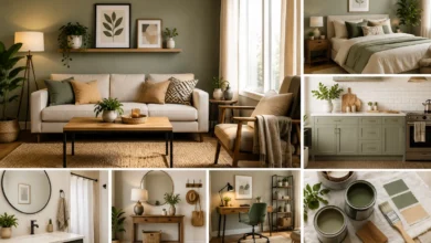
Step 5: Test in the actual room. Paint large swatches directly on the wall, and observe them at different times of day under your home’s real lighting conditions — not the lighting in a store.
Step 6: Build outward from the palette. Once your three core colors are locked in, use them to guide every other decision — furniture, textiles, art, and accessories — rather than choosing those items first and hoping they’ll match later.
Room-by-Room Color Palette Ideas
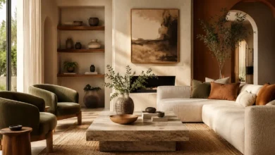
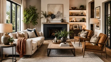
Living room. Living rooms tend to work well with warm neutrals as a dominant color (60%), a richer secondary tone in upholstery or a rug (30%), and a bold accent color in pillows or art (10%). Because living rooms host a wide range of activities, a slightly more energizing palette than a bedroom often works better here.
Bedroom. Since the bedroom’s job is to support rest, cooler or muted tones — soft blues, sage greens, warm grays — tend to outperform bright, high-energy colors. Deep, moody colors like navy have also become popular for primary bedrooms, since they can make a room feel enveloping and calm rather than stark.
Kitchen. Kitchens can handle more energy than bedrooms, since they’re active, social spaces. Warm whites, soft yellows, and even deeper cabinetry colors like sage or navy have become popular choices, often paired with warm wood tones for balance.
Bathroom. Because bathrooms are usually smaller, lighter colors tend to make the space feel larger, though a small powder room can be a great place to experiment with a bold, saturated color precisely because it’s a smaller, lower-commitment space.
Home office. Colors associated with focus and calm — blues, greens, and muted neutrals — tend to work best in a home office, supporting concentration rather than competing with it.
For more room-specific layout and design guidance beyond color, see our full room-by-room interior design guide.
Common Color Palette Mistakes to Avoid
- Choosing paint color first, before anything else. Paint is actually the easiest and cheapest thing to change later — building your palette around a “hero” piece, like a rug or a sofa, usually leads to a more cohesive result.
- Ignoring undertones. As covered above, this is the single most common reason a “safe” neutral ends up looking wrong once it’s on the wall.
- Testing only in the paint store. Store lighting rarely resembles your home’s actual lighting — always test swatches in the room itself.
- Using too many competing accent colors. The 60-30-10 rule exists precisely to prevent this — when every color gets equal weight, a room can start to feel busy rather than intentional.
- Forgetting that finishes count as color too. Metal fixtures, hardware, and even wood tones all have undertones that interact with your wall and fabric colors — they shouldn’t be an afterthought.
- Matching colors too literally. A “matching” palette where everything is the exact same shade can feel flat. Working within a coordinated family of tones, rather than one identical color, usually reads as more intentional.
Frequently Asked Questions About Color Theory for Interior Design
What is the 60-30-10 rule in interior design?
The 60-30-10 rule is a color palette formula where 60% of a room uses a dominant color (typically walls and large furniture), 30% uses a secondary color (rugs, curtains, an accent chair), and 10% uses a bold accent color (pillows, art, accessories). It’s one of the most reliable ways to build a balanced palette at any budget.
What color scheme is easiest for beginners?
Monochromatic and analogous color schemes are generally the easiest for beginners, since both rely on colors that are naturally close to one another on the color wheel, making mismatches far less likely than with complementary or triadic schemes.
How do I know if a paint color is warm or cool?
Hold the paint chip against a pure white sheet of paper — the undertone that was invisible in isolation usually becomes obvious by comparison. Warm undertones lean yellow, orange, or pink; cool undertones lean blue, green, or purple.
Does color really affect mood in a room?
Yes — this is well documented in environmental psychology research. Blues and greens are generally associated with calm and lower heart rate, warm reds and oranges are associated with energy and appetite, and yellows are associated with optimism, though individual response can vary.
How many colors should be in a color palette for a room?
Most successful interior palettes use around three main colors — a dominant, a secondary, and an accent — following the 60-30-10 rule. Additional colors can be layered in through smaller details like art or accessories, but keeping the core palette to three colors is generally the safest approach.
Should I choose my wall color or my furniture first?
Choose your overall color palette — ideally starting with a piece you love, like a rug or a sofa fabric — before committing to a specific paint color. Paint is the easiest and cheapest element to change later, so it should generally be one of the last decisions finalized, not the first.
Final Thoughts
Color theory can feel intimidating from the outside, but at its core it’s a small set of repeatable rules: understand the color wheel, respect undertones, apply the 60-30-10 formula, and always test in your room’s actual light before committing. Once you’ve internalized those basics, choosing a palette stops being a guessing game and becomes a process you can trust — one you can apply to every room in your home, not just the one you’re working on right now.
Once your palette is set, the next step is choosing furniture and lighting that support it. See our companion guides on furniture selection and room layout and interior design styles to keep building out your space with confidence.