Introduction:
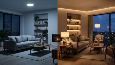
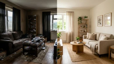
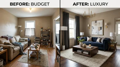
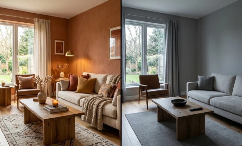
Picture this: two living rooms, identical furniture, identical layout. One feels warm, inviting, and pulled-together. The other feels flat, lifeless, and somehow always a little cold — no matter how many candles you light or throw pillows you add. The only real difference? The color on the walls.
Color is the single highest-leverage decision in any living room. A $60 gallon of paint does more to transform how a space feels than a $600 sofa ever will — yet most homeowners treat color as an afterthought, picking a shade they liked on a 2-inch sample card without understanding how it will actually behave in their specific room, at different times of day, under their particular lighting conditions, or alongside the furniture they already own.
The result is a room that feels off — and they cannot explain why. Every individual piece is fine. The sofa is good, the rug is nice, the art is interesting. But the overall effect never quite comes together. Nine times out of ten, the answer is color: the wrong shade, the wrong undertone, or a palette that simply has not been thought through as a system.
This guide is built to change that. Whether you are repainting a living room from scratch, trying to understand why your current color is not working, or looking for a 2026 palette that feels genuinely current without being a trend you will regret in 18 months — you are in the right place.
What Makes This Guide Different from Everything Else You Have Read
Most living room color guides do three things: list some pretty palettes with magazine photos, mention a few trending shades, and call it done. What they consistently skip — and what this guide covers in full — are the things that actually determine whether a color works in your specific room:
➜ The science — how color psychology affects your mood, stress levels, and even your perception of room size
➜ The light variables — why the same color looks stunning in a south-facing room and depressing in a north-facing one
➜ The undertone problem — the invisible reason two neutrals clash even though both look fine on their own
➜ The mistakes — the five things most people get wrong with living room color — and exactly how to fix them
➜ The framework — the 60-30-10 rule applied specifically to living rooms, so every decision has a logical foundation
You will also get the 2026 color trends that interior designers are actually using in client homes right now — not just what looks good on Instagram, but what holds up to daily life, ages well, and works with the furniture real people actually own. Every palette recommendation includes exact paint codes from Sherwin-Williams, Benjamin Moore, and Farrow & Ball, plus pairing guidance and room-condition requirements.
| ✅ WHAT THIS GUIDE COVERS — AT A GLANCE Section 1: The 60-30-10 color rule — your living room’s structural foundation Section 2: 7 best living room palettes for 2026 with exact paint codes and pairing guides Section 3: Quick-reference color swatch table for fast decision-making Section 4: Color psychology — what each hue does to your brain and body Section 5: The 5 most common color mistakes and how to fix them even after painting Section 6: Light-level adaptation — the section competitors always skip Section 7: Colors officially out of style in 2026 and what replaces them |
Section 1: The 60-30-10 Color Rule — Your Living Room’s Foundation
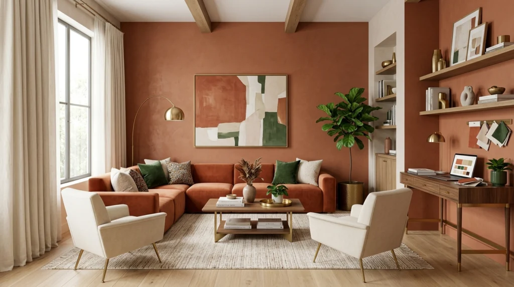
Before choosing a single paint color, understand the framework professional designers use for every project: the 60-30-10 rule. Skipping this is the single biggest reason living rooms look ‘decorated’ rather than designed.
| 60% — DOMINANT | 30% — SECONDARY | 10% — POP ACCENT |
|---|---|---|
| Walls + main sofa/large furniture | Rugs, drapes, secondary chairs | Throw pillows, art, small accessories |
| Sets the tone and mood for the room | Adds visual interest and depth | Personality and focal punch |
| Choose a calm, livable shade here | Can be slightly bolder or contrasting | This is where you take risks |
| Example: warm terracotta | Example: soft cream linen | Example: brass + forest green |
| 💡 PRO TIP: Lock the 60% First Designers always choose the dominant color before buying a single piece of furniture. Why? Because furniture comes in fixed colors — paint does not. Work from your fixed assets outward, not the other way around. |
Section 2: 7 Best Living Room Color Palettes for 2026
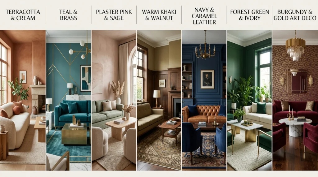
Based on designer surveys, paint brand color-of-the-year announcements, and Pinterest trend data, these are the palettes dominating living rooms in 2026 — and the exact combinations that make them work.
🎨 Palette 1: Warm Earth — Terracotta + Cream + Warm Walnut
The breakout combination of the Modern Cottage movement. Deep terracotta walls with cream upholstery and warm walnut wood tones feel grounded, cozy, and photographically stunning. This palette works in rooms with any light level because the warmth of the tones compensates for low natural light
.
➜ Wall color — Sherwin-Williams Cavern Clay SW 7701 or similar deep terracotta
➜ Sofa / main upholstery — Warm cream, oatmeal, or natural linen
➜ Accent color (10%) — Forest green throw pillows or brass lamp fixtures
➜ Wood tones — Walnut, honey oak — avoid cool gray or white-washed woods
➜ Best for — Living rooms with north- or east-facing windows; cozy spaces
🎨 Palette 2: Moody Blue-Green — Teal + Natural Linen + Brass
WGSN named ‘Transformative Teal’ their 2026 color of the year — and designers are putting it in living rooms everywhere. It hits a sweet spot between calm (blue) and alive (green), making spaces feel sophisticated without the coldness of pure navy.
➜ Wall color — Benjamin Moore Van Deusen Blue HC-156 or a teal in the ‘Quiet Moments’ family
➜ Furniture — Natural linen sofa + rattan or cane accent chair
➜ Metal finishes — Brushed brass — not chrome, not matte black
➜ Pop accent — Terracotta or dusty rose throw for warm contrast
➜ Best for — Well-lit rooms; south-facing windows; medium to large spaces
🎨 Palette 3: Plaster Pink — Dusky Rose + White Oak + Sage
Pale pinks are the new warm neutral — particularly in their muddier, more sophisticated ‘plaster’ iterations. Farrow & Ball’s Dead Salmon has become a cult favorite for this reason. This palette photographs beautifully and works across virtually every furniture style.
➜ Wall color — Farrow & Ball Dead Salmon No.28 or Benjamin Moore Pale Blush
➜ Flooring / rugs — White oak tones or a woven jute rug
➜ Accent — Dusty sage green — in pillows, a chair, or a plant cluster
➜ Best for — Smaller living rooms; feminine-leaning aesthetics; maximizing natural light
🎨 Palette 4: Warm Neutral 2.0 — Universal Khaki + Warm White + Walnut
HGTV Home by Sherwin-Williams named Universal Khaki their 2026 Color of the Year — a sandy, warm khaki that replaces the tired cool grays and stark whites of the 2010s. It functions as a true neutral that feels neither bland nor beige-y.
➜ Wall color — Universal Khaki SW 6150 or Sherwin-Williams Wool Skein
➜ Trim — Warm white — Sherwin-Williams Alabaster or BM White Dove
➜ Furniture — Mix warm walnut wood + linen upholstery
➜ Best for — Open-plan spaces; rental-friendly palettes; neutral-forward homes
🎨 Palette 5: Moody Drama — Deep Navy + Caramel Leather + Brass
For living rooms with enough size and confidence, a deep navy wall transforms an ordinary room into something that feels like a boutique hotel lounge. The trick is balancing the dark wall with warm, light furnishings — not more dark pieces.
➜ Wall color — Benjamin Moore Hale Navy HC-154 or Sherwin-Williams Naval SW 6244
➜ Sofa — Caramel leather or warm cognac upholstery
➜ Rug — Cream, ivory, or warm white — this is critical to keep the room from closing in
➜ Metals — Brass or antique gold throughout
➜ Best for — Larger rooms; rooms with multiple light sources; formal living spaces
🎨 Palette 6: Forest Green Envelop — Moss + Warm Cream + Natural Wood
Deep, smoky greens are having a massive moment in 2026. Unlike the bright sage of the early 2020s, these are richer, more complex shades — moss, olive, hunter — that make a living room feel simultaneously cozy and sophisticated.
➜ Wall color — Farrow & Ball Mizzle No.266 or Sherwin-Williams Pewter Green SW 6208
➜ Furniture — Cream or ivory upholstery — high contrast is the point
➜ Textiles — Warm bouclé throw, linen drapes in natural/unbleached white
➜ Accent — Terracotta pots with large-leaf plants — connects the palette to nature
🎨 Palette 7: Art Deco Revival — Deep Burgundy + Cream + Geometric Brass
Art Deco is making a genuine design comeback in 2026. Bold geometry, rich jewel-toned walls, and brass or gold fixtures — done well, this palette elevates a living room into something that looks genuinely editorial.
➜ Wall color — Benjamin Moore Silhouette (Color of the Year 2026) or a deep merlot-adjacent tone
➜ Furniture — Cream or off-white upholstery with gold/brass legs
➜ Art — Geometric prints, vintage frames, bold symmetry
➜ Best for — Formal or entertaining-focused living rooms; rooms with crown molding or architectural detail
Section 3: Quick-Reference Color Swatch Guide
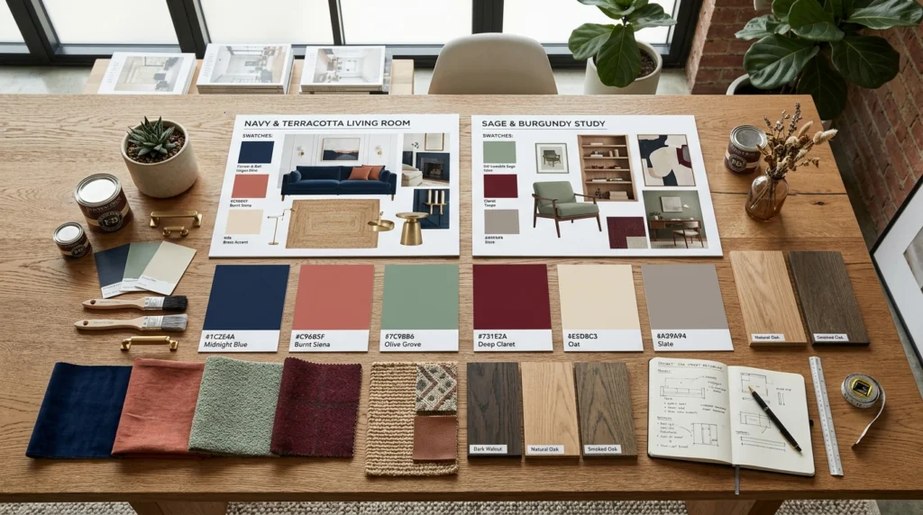
Use this table as a decision-making tool. Find your mood, then match it to a palette and exact paint code.
| COLOR NAME | HEX CODE | PAIRS WITH | MOOD / FEEL |
|---|---|---|---|
| Cavern Clay SW 7701 | #B5603E | Cream linen + walnut | Warm, grounded, cozy |
| Universal Khaki SW 6150 | #B8A882 | Warm white trim + oak | Calm, timeless, neutral |
| Hale Navy HC-154 | #2B3A52 | Caramel leather + brass | Dramatic, sophisticated |
| Dead Salmon F&B No.28 | #C8977D | White oak + sage green | Soft, romantic, airy |
| Mizzle F&B No.266 | #6E7A5C | Ivory upholstery + wood | Earthy, alive, rich |
| Benjamin Moore Silhouette | #5C2233 | Cream + geometric brass | Bold, editorial, dramatic |
| Sea Salt SW 6204 | #A8BDB5 | White + natural fiber rugs | Serene, coastal, refreshing |
Section 4: Color Psychology — What Each Hue Does to Your Brain
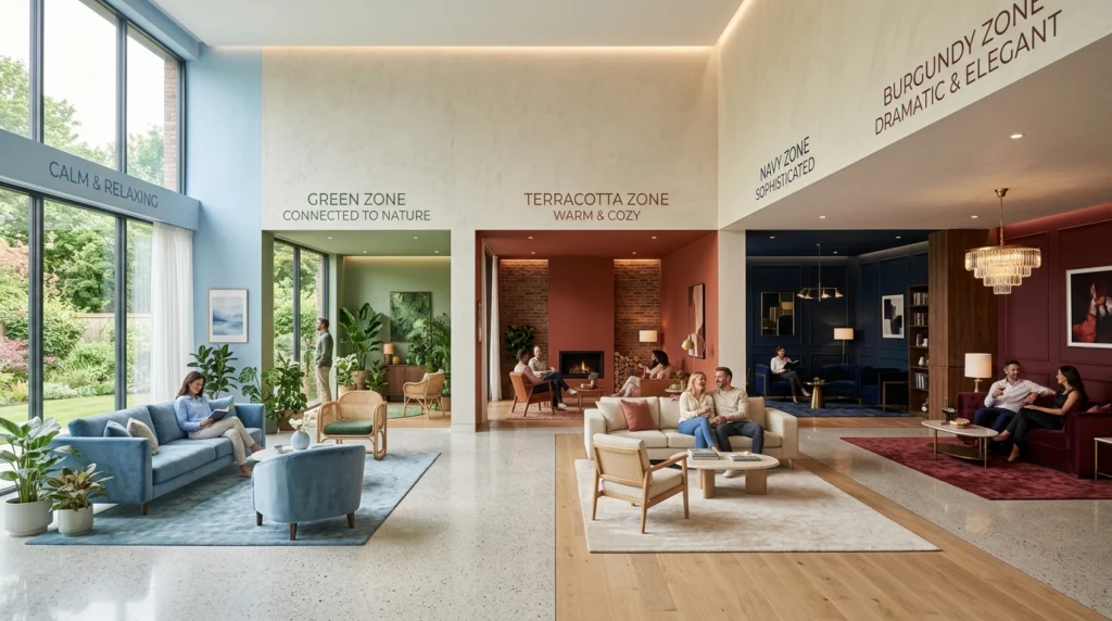
This is the gap most color guides skip entirely: the science behind why certain palettes feel better than others. These aren’t opinions — they’re documented findings from environmental psychology research.
| COLOR FAMILY | PSYCHOLOGICAL EFFECT | BEST LIVING ROOM USE |
|---|---|---|
| Blues & Teals | Lower heart rate + cortisol; reduce anxiety | Rooms for relaxation; open-plan spaces |
| Greens | Connect to nature; promote calm focus | Rooms facing the garden or with plants |
| Terracotta/Clay | Ground and warm; feel safe and enveloping | North-facing or low-light living rooms |
| Deep Navy/Charcoal | Create intimacy; signal sophistication | Large rooms that feel too vast/cold |
| Warm Whites/Cream | Feel welcoming vs clinical; add breathing room | Light, airy spaces; small living rooms |
| Burgundy/Plum | Stimulate depth; feel theatrical and special | Formal entertaining spaces; feature walls |
| Sage/Dusky Pink | Soothe without boring; quietly optimistic | Everyday living rooms; family spaces |
Section 5: The 5 Living Room Color Mistakes — and How to Fix Them
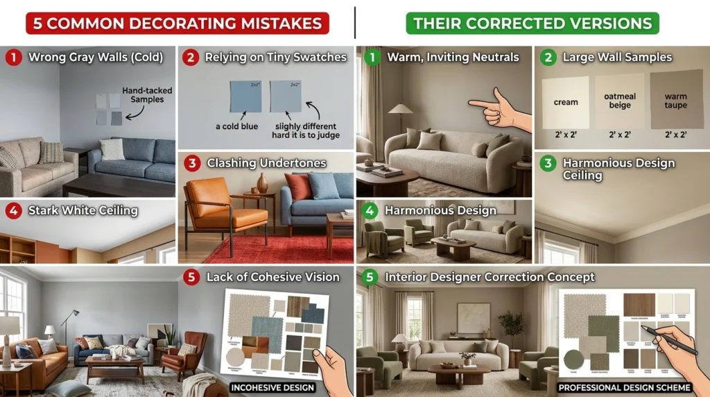
| ❌ MISTAKE 1: Choosing paint color before furniture Fix: Start with your fixed pieces (sofa, flooring, fireplace). Pull one of their undertones as your dominant wall color. Paint never limits your options — furniture does. |
| ❌ MISTAKE 2: Testing paint only on a small strip Fix: Paint a 12″x12″ minimum square on at least two walls — the one that gets morning light and the one opposite. View it at three times of day. Colors shift dramatically between 8 AM and 7 PM. |
| ❌ MISTAKE 3: Forgetting the ceiling is the fifth wall Fix: Painting the ceiling 1-2 shades lighter than your walls (in the same color family) makes the room feel taller and more intentional. A flat white ceiling with a colored wall often creates a jarring contrast. |
| ❌ MISTAKE 4: Using cool gray as a ‘safe’ neutral Fix: Cool gray is officially over in 2026. Designers are unanimous: it reads as lifeless and flat in most living rooms. Swap for warm greige, sandy khaki, warm white, or any earth-adjacent neutral instead. |
| ❌ MISTAKE 5: Not accounting for undertones Fix: Every white, gray, and beige has an undertone — pink, green, yellow, or blue. A white with a pink undertone next to a sofa with a green undertone creates an invisible clash that makes the room feel wrong. Always compare undertones before buying. |
Section 6: Adapting Color for Your Room’s Light Level
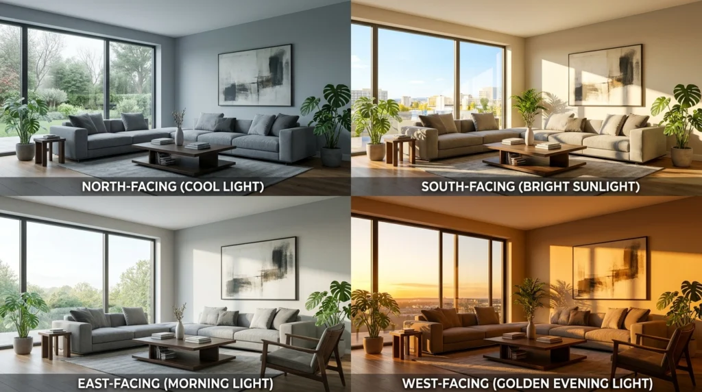
This is the gap most competitor articles miss entirely: the same color behaves completely differently depending on how much natural light your living room receives. Here’s your quick-reference guide.
| LIGHT LEVEL | WHAT HAPPENS TO COLOR | RECOMMENDED PALETTE APPROACH |
|---|---|---|
| North-facing (low/cool light) | Cool tones feel gray and cold; shadows dominate | Go warm: terracotta, amber, warm greens. Avoid blues and grays entirely. |
| South-facing (bright, warm light) | Warm tones can wash out; colors look lighter | You can use cooler blues/greens; deep saturated tones hold best. |
| East-facing (morning light) | Golden AM light; bluer/shadowed afternoons | Medium warm tones — teal, warm sage, plaster pink — work year-round. |
| West-facing (afternoon/evening light) | Rich golden tones in PM; harsh afternoon glare | Cooler tones balance the warmth; navy or teal walls shine here. |
| No/minimal natural light | All colors read darker and flatter | Go 1-2 shades lighter than your target. Add accent lighting before painting. |
| 💡 THE LIGHT TEST — Do This Before Every Paint Purchase Buy Samplize peel-and-stick samples (or brush 12″x12″ on your wall) View the sample at 8 AM, 12 PM, and 7 PM — with and without lamps on Hold the sample next to your sofa fabric and rug If it passes all three time slots, it’s your color |
Section 7: Living Room Colors to Avoid in 2026
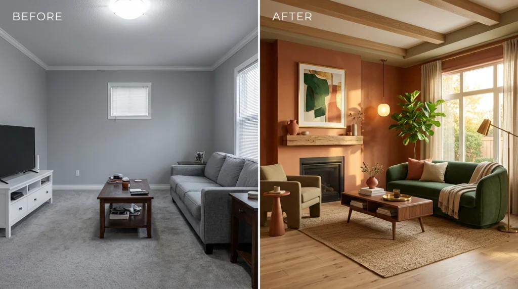
Equally important as what to use — here’s what leading interior designers are removing from living rooms this year:
➜ Millennial gray — Cool, flat, and lifeless in natural light. Replace with warm greige or sandy khaki.
➜ Stark bright white — Feels clinical in a living room. Replace with Alabaster, White Dove, or any warm-toned white.
➜ Plain beige / taupe — Lacks depth. Replace with richer earthy browns, warm clay, or plaster pink.
➜ Loud neon or over-saturated brights — Hard to live with long-term. Choose ‘quiet’ versions of your favorite bold color instead.
➜ Matching everything to one color family — Monotone rooms feel flat. Always introduce at least one contrasting texture or tone.
FAQs: Living Room Color Schemes
A: Warm earthy tones dominate 2026 — particularly terracotta, warm khaki (like Sherwin-Williams Universal Khaki), deep teal, and dusty plaster pink. Cool grays and stark whites are being replaced by colors with more depth, warmth, and personality.
A: Go at least 1-2 shades lighter than your target color, and always choose warm-toned hues — terracotta, warm cream, or sandy neutrals. Pair with warm-white (2700K) lighting, and use a large mirror opposite any light source to multiply what natural light exists.
A: Light, warm whites (Alabaster, White Dove), soft plaster pink, and warm pale greens all visually expand small spaces. Paint walls, trim, and ceiling in the same color family to eliminate the visual ‘boxing-in’ effect of contrasting trim. Avoid dark colors in very small rooms unless you have excellent lighting.
A: The 60-30-10 rule divides your color budget: 60% dominant color (walls and main furniture), 30% secondary color (rugs, drapes, accent chairs), and 10% pop accent (throw pillows, art, accessories). This formula creates visual harmony without a room feeling monotone or chaotic.
A: Yes — but balance is essential. Dark walls (navy, forest green, burgundy) need lighter furniture, warm lighting from multiple sources, and a light-colored rug to prevent the room from feeling cave-like. Dark colors work best in larger rooms or spaces with multiple windows.
A: Millennial gray, stark bright white, generic taupe/beige, and cool-toned neutrals are all fading. Designers are moving toward warmer, more layered palettes with personality — earth tones, dusky pinks, deep greens, and moody blues.
A: Choose a paint color that picks up an undertone already present in your most prominent furniture piece. Then use your 30% (rug, drapes) to introduce one additional color that bridges the mismatched pieces. Often, a warm neutral on the walls is the most effective ‘glue’ color.
Conclusion: Your Living Room Color Journey Starts With One Good Decision
Here is the most important thing to take away from everything in this guide: there is no universally perfect living room color. The right color for your space depends on your room’s light direction, your fixed furniture, how you want to feel in the space, and the life you actually live in it. A palette that looks extraordinary in a south-facing Manhattan apartment may feel cold and dull in a north-facing suburban living room — and vice versa.
What does exist is a right process — and that process is exactly what this guide has walked you through. Start with your room’s fixed assets and light conditions. Apply the 60-30-10 rule to build a palette with structure, not just instinct. Use the 2026 trending palettes as a curated shortlist of directions that are proven to work right now. Test before you commit. And layer your lighting alongside your color decisions, because even the most beautiful wall color looks flat under the wrong bulb temperature.
The seven palettes in this guide — from the warm earthiness of terracotta and cream, to the bold drama of deep navy and caramel leather, to the editorial sophistication of Art Deco burgundy — all work for different personalities, different rooms, and different lifestyles. None of them are wrong. The only wrong choice is defaulting to cool gray out of habit, or picking a color because it looked good on someone else’s Instagram, without knowing whether it will work in your specific space.
The Bigger Picture: Color as a Long-Term Investment
Well-chosen living room colors do something that no piece of furniture can do: they make every other element in the room look more intentional, more expensive, and more cohesive. A $30 throw pillow in exactly the right accent color can look like it was custom-ordered. A $200 side table in the wrong finish will look like a mistake regardless of its quality.
This is why designers always lock in color and lighting decisions before recommending a single piece of furniture. Color sets the context for everything else. Get it right, and you give every future purchase in that room the best possible chance of working. Get it wrong, and no amount of carefully selected accessories will fix the underlying problem.
In 2026, the design world is moving away from the safe, cold, and generic — away from millennial gray, stark white, and flat beige — and toward palettes that feel personal, warm, layered, and intentional. Terracotta. Deep teal. Plaster pink. Forest moss. Rich burgundy. These are not bold risks. In the hands of the right light conditions and the right furniture pairings, they are the most livable, rewarding colors you can put on a wall.
| KEY TAKEAWAYS FROM THIS GUIDE ➜ Foundation first — Choose color after identifying your fixed assets, never before ➜ 60-30-10 always — Structure every palette — dominant, secondary, accent — before buying a single item ➜ Light is everything — Test paint at three times of day; adapt your palette to your room’s light direction ➜ Undertones matter — Mismatched undertones create invisible clashes that ruin otherwise good palettes ➜ 2026 direction — Warm, earthy, layered — away from cool gray and toward terracotta, teal, sage, and plaster tones ➜ Mistakes are fixable — Wrong ceiling color, bad undertone match, furniture-first choices — all correctable with the guidance in Section 5 |
One Final Thought
The best living room color is the one that makes you feel something good the moment you walk in. Not the one that photographs well. Not the one that your neighbor chose. Not the one that was trending two years ago and is still sitting in your cart.
Your living room is the room you come home to, the room you host in, the room where your family lands at the end of the day. It deserves a color that was chosen deliberately — for your light, your furniture, your lifestyle, and the version of home you actually want to live in.
You now have everything you need to make that choice well. Go test some samples.
| YOUR FINAL ACTION CHECKLIST Identify your room’s light direction: north, south, east, or west facing List your fixed assets — sofa color, flooring material, fireplace or architectural details Choose a dominant wall color from the 7 palettes in Section 2 that fits your light and furniture Apply the 60-30-10 rule to map out your secondary and accent color choices Buy 2 to 3 paint samples and apply them as 12×12 inch patches on two different walls View each sample at 8 AM, 12 PM, and 7 PM — with lamps on and off Hold the sample next to your sofa fabric and rug before making a final call Once your wall color is confirmed, layer in warm-white 2700K lighting across ambient, task, and accent sources Add your 30% secondary and 10% accent pieces last — after the paint is dry and in place |
Also Read: Complete Home Decor Guide: Styles, Tips, and Budget-Friendly Ideas for Every Room